Every modern e-commerce site feels like a spreadsheet that went to finishing school. You know the look. It is all clean white backgrounds, rigid 12-column grids, and "Buy Now" buttons placed with surgical precision to exploit your dopamine receptors. We have spent a decade optimizing the joy out of shopping in the name of conversion rates.
But a new independent project called TalknBuy is throwing the rulebook out the window.
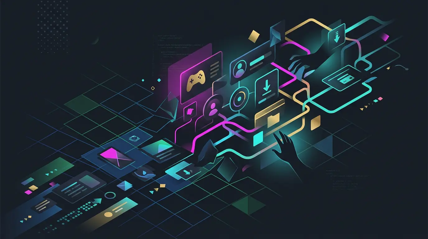
Developed by a lone coder and shared recently on the r/SideProject subreddit, TalknBuy is a functional demo that reimagines the storefront as a 2D game. Instead of scrolling through a list of thumbnails, you move a character through a digital space. It feels less like Amazon and more like a localized version of Stardew Valley where the NPCs actually want to sell you a physical t-shirt. It is a defiant, playful experiment that suggests we might be ready to trade raw efficiency for a little bit of soul.
The Death of the Grid
For years, the industry has suffered from serious UX fatigue. We have reached a point of design convergence where every Shopify store looks identical to every BigCommerce store. This "Amazon-ification" of the web treats the user like a ghost in a machine, someone whose only purpose is to click through a funnel as fast as possible. Friction is the enemy.
TalknBuy takes the opposite approach. By adopting a 2D game aesthetic, the developer is intentionally reintroducing friction as a feature. You cannot see every product at once. You have to explore. You have to walk your avatar past one item just to get to the next. In a world of one-click ordering, this feels almost radical. It turns the act of shopping into a narrative experience rather than a chore. It is the digital equivalent of a boutique shop in a winding alleyway versus the sterile, fluorescent aisles of a big-box retailer.
Inside the Demo
The project, currently live at store.talknbuy.com, is a lean proof of concept. When you land on the page, the familiar tropes of retail are gone. There are no sidebars or filter toggles. Instead, you are dropped into a visual world that demands interaction. The community reaction on Reddit has been a mix of nostalgic delight and technical curiosity.
I spent some time clicking around the demo, and the immediate sensation is one of discovery. In a standard grid, your eyes scan for what you already want. In a 2D game space, you stumble upon things. It captures that specific "window shopping" feeling that has been missing from the internet since the early 2000s. The developer is explicitly asking for feedback from the community, recognizing that this is a departure from everything we are told "works" in web design.
The Technical Reality Check
As a developer, I look at this and see a massive challenge in state management and real-time synchronization. The creator has been transparent about the current limitations. A note on the project explicitly states that "websockets are coming."
This is a crucial detail. Right now, the "Talk" part of TalknBuy is largely theoretical. For this to move from a visual gimmick to a legitimate platform, it needs that real-time social layer. Imagine walking through a store and seeing other customers as avatars, or having a store clerk jump into a chat bubble to answer a question. That requires a robust WebSocket implementation to handle concurrent users without melting the server.
We also have to talk about the black box of the backend. While the UI demo is charming, we have no insight yet into the payment processing, inventory management, or security protocols. Building a game is hard, but building a secure e-commerce engine that people trust with their credit card info is an entirely different beast. For now, TalknBuy is a brilliant front-end experiment, but the "Buy" side of the equation remains unverified.
Is Gamification the Future of Retail?
The tension here is between Conversion Rate Optimization (CRO) and user engagement. If your goal is to buy a replacement vacuum filter in thirty seconds, TalknBuy will frustrate you. But if a brand wants to build a community or tell a story, this interactive UI is a goldmine.
There are obvious hurdles. Accessibility is the big one. How does a screen reader navigate a 2D game world? How does a user on a slow mobile connection handle the asset load? These are the questions that usually kill experimental UI before it reaches the mainstream.
However, for a specific niche of high-concept brands, the trade-off might be worth it. Longer session times and higher brand loyalty are the holy grails of modern marketing, and playfulness is a direct path to both.
A Return to the Digital Mall
I suspect we are seeing a pendulum swing. We spent the last decade making the web as fast and invisible as possible. Now, we are realizing that invisible is also boring. Projects like TalknBuy remind us that the internet used to be a place we "visited" rather than just a tool we used.
Will we see Nike or Apple move to a 2D game interface tomorrow? Probably not. But the DNA of this project (the idea that shopping can be a form of entertainment) is starting to infect the edges of the industry. We are heading toward a future that looks a lot more like a digital mall and a lot less like a digital warehouse. In an age of instant gratification, maybe we are finally ready to trade a little efficiency for a bit of fun.