For years, using an Android tablet felt like trying to wear a pair of jeans three sizes too big. The hardware was often impressive, but the software felt loose, baggy, and ultimately unsuited for the frame. You were essentially looking at a smartphone interface that had been stretched until the pixels screamed for mercy. Thankfully, Google is finally signaling that the era of the oversized phone is coming to an end.
The latest update to Chrome for Android is rolling out a dedicated bookmarks bar specifically for tablets and foldables. It sounds like a minor tweak, but for anyone who has tried to use a Pixel Tablet or a Galaxy Fold as a primary work machine, it is a massive step toward legitimacy. Google is explicitly trying to align the mobile browser with the desktop experience, acknowledging that when you have ten inches of screen real estate, you should be able to use it like a professional.
The Desktop Experience Comes to Mobile
This update is not just a cosmetic facelift. It is a functional overhaul of how we interact with the web on the move. According to the latest rollout details, the bookmarks bar is being integrated directly into the Chrome interface for larger form factors. The positioning is exactly what you would expect from your MacBook or PC, as the bar sits directly below the address bar and spans the full width of the screen.
In the past, accessing a bookmark on Android required a series of clumsy taps. You had to hit the three-dot menu, find the bookmarks folder, and then scroll through a list that took over your entire view. Now, Google is mirroring the desktop version of Chrome to eliminate that friction. The new design displays favicons alongside site names, giving you that instant, at-a-glance navigation that desktop users have taken for granted for decades.
Folders are also part of the package. They open inline, which means you can browse your categorized work links or news sites without being kicked into a separate full-screen menu. If you have more bookmarks than horizontal space allows, Google has included a right-facing chevron at the end of the bar. This provides quick access to the rest of your list, ensuring that your most important tools are always one tap away.
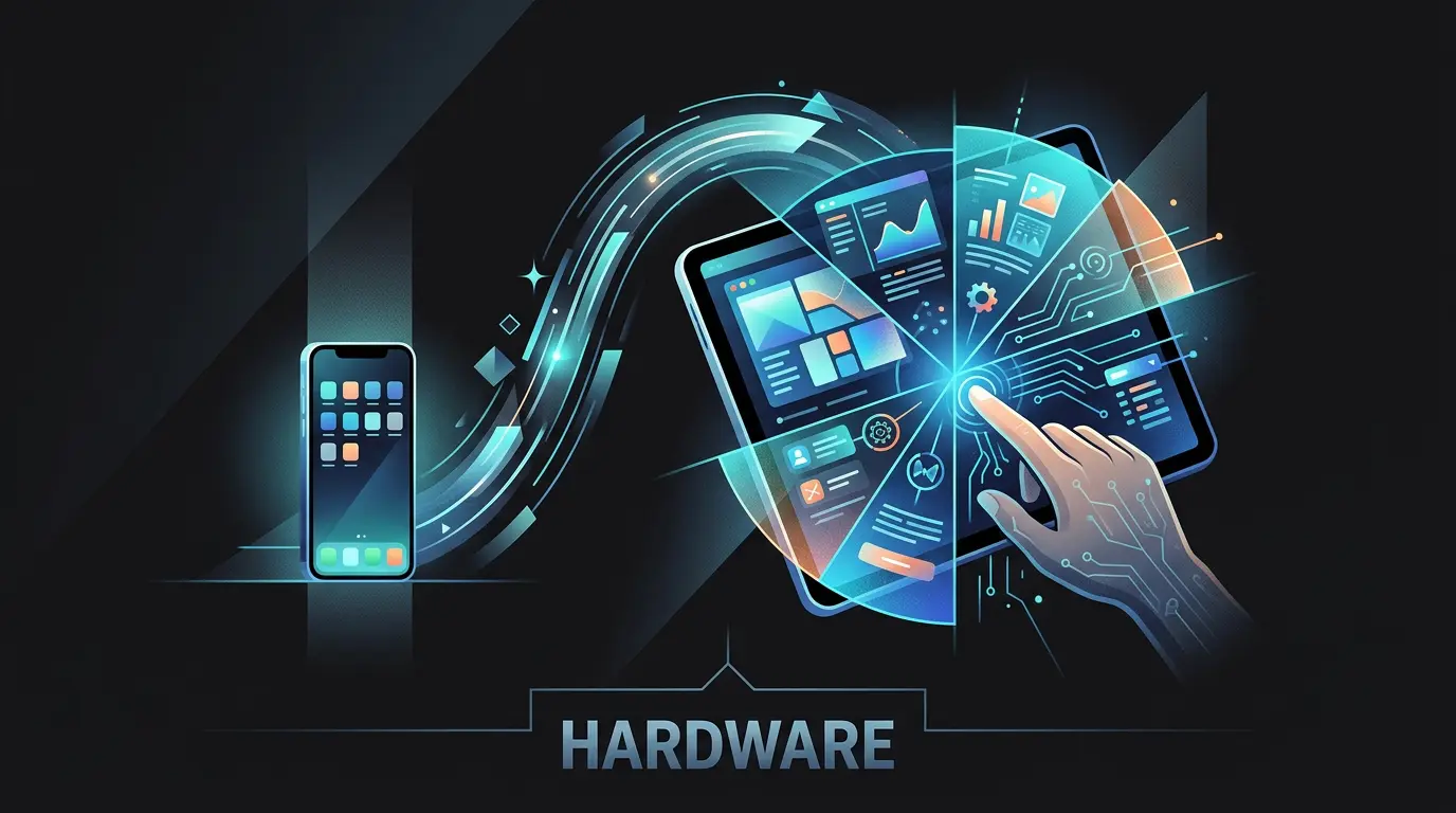
Treating Foldables as Desktop-Class Hardware
I have spent a lot of time testing the current crop of foldables, and the biggest hurdle has always been the mental context switch. When you unfold a device like the Pixel Fold, you expect a workstation. When the browser still acts like a phone app, it breaks the illusion of productivity. By introducing this bookmarks bar, Google is signaling a pivot in its hardware philosophy. They are no longer treating foldables as experimental toys (they are treating them as desktop-class workstations).
This move is about efficiency. If you are multitasking in split-screen mode, every tap matters. Having a persistent row of your most-visited sites saves seconds that add up over a workday. It is the digital equivalent of moving your most-used tools from a locked drawer to the top of your workbench. You might not think a bookmarks bar is a big deal until you realize how much it streamlines a research-heavy workflow.
The Future of Chrome Across Form Factors
This update raises an interesting question about the long-term roadmap for Google's operating systems. We have seen ChromeOS and Android start to share more DNA over the last few years, and this UI update feels like another stitch in that bridge. If Chrome for Android becomes indistinguishable from Chrome on a Chromebook, the hardware it runs on becomes almost secondary.
Developers and web designers now have to face a new reality. They can no longer assume that a mobile user is someone with limited space and a single-column view. A user on a foldable might be browsing with a desktop-style interface, expecting desktop-style interactions, while sitting on a bus. The distinction between mobile and desktop browsing is not just blurring, it is effectively evaporating.
As someone who has covered the tablet market since the original iPad, I find this shift fascinating. We spent a decade trying to make tablets their own unique category with their own unique gestures. Now, we are realizing that the most productive thing a tablet can be is a highly portable version of the computer we already know how to use.
At what point does the mobile label become a hindrance? If Chrome for Android is becoming a desktop-in-your-pocket, we might soon stop talking about mobile versions of apps entirely. We might just start talking about Chrome, regardless of whether it is in your hand or on your desk. This bookmarks bar is a small strip of pixels, but it represents a massive change in how Google expects us to get things done.