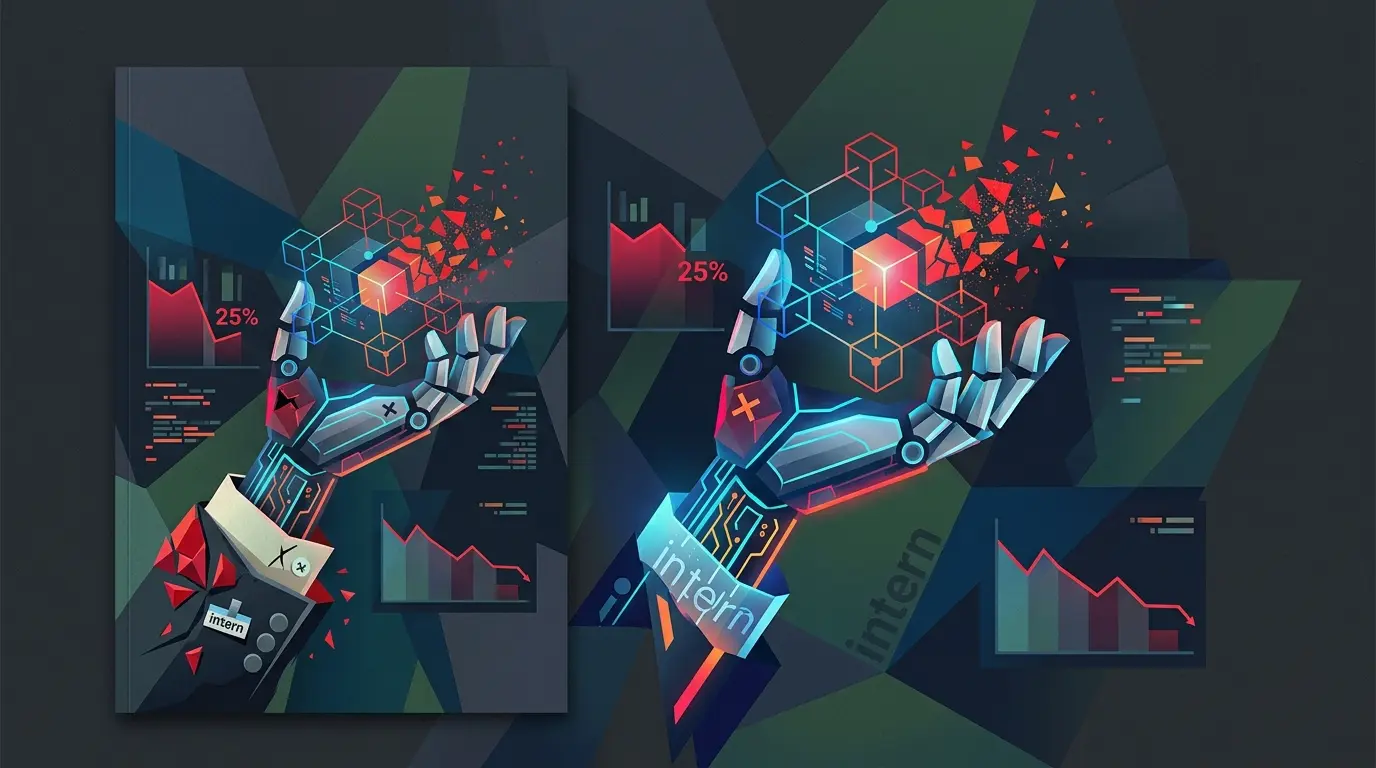
Andrej Karpathy has spent the better part of a decade teaching machines how to see the world. Now, he is trying to help humans see the labor market. The man who led AI at Tesla and co-founded OpenAI has shifted his focus from neural networks to a different kind of architecture. His latest project is a web-based data visualizer that treats the American workforce as a single, interactive map. It is a sharp departure from the sterile way we usually consume economic data.
Most of us view the Bureau of Labor Statistics (BLS) website as a digital basement. It is a place filled with heavy spreadsheets and dry PDF reports that feel inaccessible until a news cycle boils them down into a single, terrifying headline. Karpathy decided to bypass the middlemen entirely. He built a tool that maps 342 distinct occupations and 143 million jobs into a treemap layout. In this view, the area of each rectangle is proportional to the total number of people employed in that specific job. It is a bird’s-eye view of the American Dream, rendered in real-time metrics.
The Architecture of the Workforce
From a technical perspective, the tool functions as a high-level diagnostic instrument for the economy. Each tile represents a career path. You can see the massive, heavy blocks for retail and healthcare, sitting alongside the tiny, specialized slivers for niche roles. The visual weight of these sectors tells a story that a bar chart simply cannot. It shows the sheer scale of the human labor currently keeping the country running.
Users can toggle between several data layers, including median pay, required education levels, and projected growth outlooks. These are the traditional yardsticks of a career. However, the most provocative addition is the "AI exposure" metric. By integrating this alongside standard government data, the tool allows users to see exactly where technological shifts might collide with occupational stability. It is a way to cross-reference a salary with a potential volatility score that many of us in the AI research community have been discussing in the abstract for years.
Mapping the Latent Space of Automation
As someone who spends a lot of time looking at model capabilities and benchmarks, I find the inclusion of AI exposure to be the most significant part of this project. We often talk about how Large Language Models will change the world, but we rarely see that impact mapped against the actual headcount of the US economy. This tool bridges that gap. It allows a worker to click on a tile and see the direct BLS occupational page, grounding the high-level data in granular reality.
It is important to remember the creator’s own disclaimer. Karpathy is clear that this visualizer is a development project rather than a formal economic report or an academic paper. It is an exploration of how we can use data storytelling to help the general public understand shifts that are often too big to grasp. It is less about being a definitive authority and more about providing a lens through which we can view our professional futures.
The Future of the Career Compass
In the lab, we measure progress in tokens and parameters. In the real world, progress is measured in job security and wage growth. This tool forces those two worlds to occupy the same space.
When you filter by AI exposure, the map changes. Certain high-paying, high-education sectors light up in ways that might have seemed impossible a decade ago. It suggests that the traditional path (the idea that more education always equals more safety) might be under revision.
I have often wondered if our current career guidance systems are outdated. We tell students to look at growth projections and salary caps, but we rarely talk about the technical feasibility of automating their chosen path. This visualizer changes that conversation. It makes the intangible threat of automation tangible. It turns a theoretical debate into a physical space you can explore with a mouse click.
A New Standard for Economic Literacy
There is something visceral about seeing 143 million jobs laid out on a single screen. It removes the abstraction of the word "economy" and replaces it with a map of human effort. As we move deeper into this era of rapid model iteration, tools like this will likely become the new standard for career planning. We are moving past the era where a static spreadsheet is enough to explain the world.
Will we eventually see a world where "AI exposure" is a more important metric than "median pay"? For a student entering university today, the answer might already be yes. If your chosen field has a high exposure rating, a high starting salary might just be a temporary premium for a role that is about to change forever. Karpathy’s tool is a reminder that while the data comes from the past, the way we visualize it can help us prepare for a very different future.